Skip to content

Data Science Tutorials

For Data Science Learners

  • Two Sample Proportions test in R
    Two Sample Proportions test in R-Complete Guide R
  • Best Data Science YouTube Tutorials
    Best Data Science YouTube Tutorials Free to Learn Course
  • Arrange the rows in a specific sequence in R
    Arrange the rows in a specific sequence in R R
  • Sort Data in R With Examples
    Sort Data in R With Examples R
  • Checking Missing Values in R
    Checking Missing Values in R R
  • best books about data analytics
    Best Books to Learn Statistics for Data Science Course
  • Convert multiple columns into a single column
    Convert multiple columns into a single column-tidyr Part4 R
  • Select variables of data frame in R R
stacked barplot in R

Stacked Barplot in R

Posted on December 20December 20 By Admin No Comments on Stacked Barplot in R

Stacked Barplot in R, A stacked bar chart is a type of bar chart that looks at two categorical variables instead of just one when examining numerical data.

A stacked barplot is a type of chart used to display the composition of a whole or total value in terms of its parts.

It is created by stacking individual bars on top of each other, with each bar representing a specific category or component of the whole.

The height of each bar represents the proportion or percentage of the total value that it contributes.

Stacked barplots are commonly used in data analysis and visualization to compare the relative sizes and contributions of different categories or components to a larger whole.

Stacked Barplot in R

This article explains how to make one with R. Here, a stacked bar chart is produced using the barplot() method.

Predictive Modeling and Data Science » Data Science Tutorials

barplot(H,xlab,ylab,main, names.arg,col) is the syntax.

Setting parameters

H: is a bar chart vector or matrix that holds numerical values.
xlab: The label for the x-axis.
ylab: The label for the y-axis.
main: The bar chart's title.
names.arg: A vector of names that show beneath each bar.
col: is used to give the graph's bars colors.
dat <- read.table(text = "A B C D E F G
1 20 80 30 90 70 60 90
2 30 50 70 50 40 10 40
3 50 80 80 60 60 30 160
4 10 40 70 80 20 10 70", header = TRUE)
barplot(as.matrix(dat))
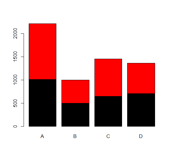
dat <- read.table(text ="A B C D
1 1010 500 650 708
2 1200 500 800 655", header= TRUE)
barplot(as.matrix(dat),col=c("black","red"))

How to Extract Minutes from Datetime in R » finnstats

R

Post navigation

Previous Post: How to create summary table in R
Next Post: How to Find Correlation Coefficient p value in R

Related Posts

  • Find the Maximum Value by Group in R
    Find the Maximum Value by Group in R R
  • How to Count Distinct Values in R
    How to Count Distinct Values in R R
  • Descriptive statistics in R R
  • How to copy files in R
    How to copy files in R R
  • How to plot categorical data in R
    Plot categorical data in R R
  • How to Find Unmatched Records in R
    How to Find Unmatched Records in R R

Leave a Reply Cancel reply

Your email address will not be published. Required fields are marked *

  • Best Prompt Engineering Books
  • Understanding Machine Learning and Data Science
  • Best Git Books
  • Top 5 Books to Learn Data Engineering
  • Mastering R Programming for Data Science: Tips and Tricks
  • About Us
  • Contact
  • Disclaimer
  • Privacy Policy

https://www.r-bloggers.com

  • YouTube
  • Twitter
  • Facebook
  • Course
  • Excel
  • Machine Learning
  • Opensesame
  • R
  • Statistics

Check your inbox or spam folder to confirm your subscription.

  • Augmented Dickey-Fuller Test in R
    Augmented Dickey-Fuller Test in R R
  • similarity measure between two populations
    Similarity Measure Between Two Populations-Brunner Munzel Test Statistics
  • How Cloud Computing Improves Workflows in Data Science
    How Cloud Computing Improves Workflows in Data Science Machine Learning
  • best books about data analytics
    Best Books About Data Analytics Course
  • Data Science Strategies for Improving Customer Experience in R
    Data Science Strategies for Improving Customer Experience in R R
  • How to get the last value of each group in R
    How to get the last value of each group in R R
  • Replace first match in R R
  • How to create a ggalluvial plot in r
    How to create a ggalluvial plot in R? R

Privacy Policy

Copyright © 2025 Data Science Tutorials.

Powered by PressBook News WordPress theme