How to Display Percentages on Histogram in R, A histogram is one of the most commonly used charts to illustrate the distribution of a dataset.
Histograms plot the frequency of observations of a variable using non-overlapping intervals, also called bin widths, on the horizontal axis and the count or percentage frequency on the vertical axis.
The histogram presentation is relevant when you want to identify the underlying distribution of your data. It helps identify the mode, the skewness, and the kurtosis.
By presenting data on a histogram, you can also visually identify potential outliers and other patterns concerning the histogram’s overall shape.
Computational Gastronomy for Data Science » Data Science Tutorials
This article will provide you with a detailed guide on how to display percentages on a histogram with multiple examples in R. It will include the following sections:
– Creating a Basic Histogram in R
– Using the ggplot2 package for Histograms
– Adding Percentage Labels to Histograms
– Applying Customized Colors to Histograms
– Grouping Data in Histograms.
Creating a Basic Histogram in R
Before exploring the complexities of histogram graphs, let’s explore a simple example. First, let’s generate a vector of random numbers that follows a normal distribution with a mean of 50 and a standard deviation of 10.
set.seed(1)
x <- rnorm(100, mean = 50, sd = 10)
We will visualize the distribution with a histogram. By default, the R’s hist() function will display the frequency counts for each bin width.
hist(x)
Using the ggplot2 package for Histograms
While R’s standard histogram functions are useful, ggplot2 provides a more flexible and aesthetic way to create histograms. We begin by installing and then loading ggplot2.
install.packages("ggplot2")
library(ggplot2)
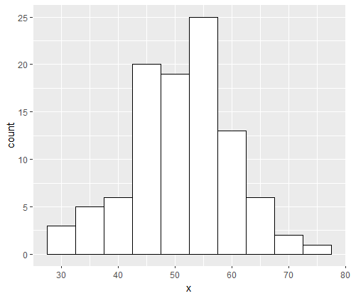
Now we can create a more formatted histogram by using ggplot2. We use the following syntax to create the histogram.
ggplot(data = data.frame(x), aes(x = x)) +
  geom_histogram(binwidth = 5, color = "black", fill = "white")

Adding Percentage Labels to Histograms
In a histogram, displaying absolute frequencies may not be an optimal method to explain the distribution of the dataset.
In such cases, you can consider presenting the relative frequencies or the percentages of each bin as labels on top of each bar.
ggplot(data = data.frame(x), aes(x = x)) +
  geom_histogram(aes(y = (..count..)/sum(..count..)*100), binwidth = 5, color = "black", fill = "white") +  scale_y_continuous(labels = function(x) paste0(x, "%"))

In the code above, we set the y-axis values to (..count..) / sum(..count..)*100, a simple formula that divides the frequency count by the total number of observations, and multiplies by 100 to get a percentage.
We then add the scale_y_continuous(labels = function(x) paste0(x, “%”)) line to change the y-axis tick labels.
We use the paste0 function here to concatenate the percentage with each tick mark.
There is an alternative way to calculate percentages in histograms.
Instead of using y = (..count..)/sum(..count..)*100), we can use the y = (..count..)/sum(..count..)*100 / binwidth, where binwidth is the width of each bin.
ggplot(data = data.frame(x), aes(x = x)) +
  geom_histogram(aes(y = (..count..)/sum(..count..)/5*100), binwidth = 5, color = "black", fill = "white") +  scale_y_continuous(labels = function(x) paste0(x, "%"))

Applying Customized Colors to Histograms
Sometimes it is helpful to present data with more than one color in the histogram plot.
For instance, if you want to display the most important observations with a different color, it could be beneficial to choose an appropriate color to highlight them.
In the example below, we will color the bins below 45 points that are more common in blue, and bins above this threshold that are less frequent in red.
#Create custom colors
my_colors <- c("#3E6B9F", "#E04E2C")#Plot histogram with custom colors
ggplot(data = data.frame(x), aes(x = x)) +
  geom_histogram(binwidth = 5, aes(fill = (x < 45) + 1), color = "black") +
  scale_fill_manual(values = my_colors) +
  theme_minimal()

We used aes(fill = (x < 45) + 1) to instruct ggplot2 to draw different colors for the bins below the threshold. We then used the scale_fill_manual() function to specify the colors.
The first argument for this function is the list of colors, and the second argument specifies the series of data that they represent.
We then used the theme_minimal() function to remove the background.
R Error: Cannot Allocate Vector of Size X GB » finnstats
Grouping Data in Histograms
Sometimes, it is useful to separate the data by using the colors. The example code below shows how to overlay two groups of data on top of each other.
In this example, we will use the mtcars dataset that contains various attributes of 32 cars driven in 1973-74, by Motor Trend magazine.
#Import mtcars dataset
data(mtcars)
#Group data by the “cyl” variable and plot the histogram
ggplot(mtcars, aes(x = hp, fill = as.factor(cyl))) +
  geom_histogram(binwidth = 10, color = "black", alpha = 0.7, position = "identity") +
  scale_fill_brewer(palette = "Set1") +
  labs(title = "Horsepower distribution by cylinder count", x = "Horsepower", y = "Frequency") +  theme_classic()

In the code above, we added a fill argument in ggplot(mtcars, aes(x = hp, return as.factor(cyl))) call telling ggplot2 to group data by the cylinder count (cyl) of cars.
In geom_histogram, we used the position = “identity” argument to place each histogram bin starting at the x-value of the bin rather than stacking them on top of each other.
We finally used the scale_fill_brewer() function to specify a color palette, and the theme_classic() function to style the plot.
Conclusion
Histograms are useful tools to visually display the distribution of a dataset. In this article, we discussed how to create a basic histogram in R and how to use the ggplot2 package for histograms.
We explored how to add percentage labels and customize colors to histograms. We also learned how to group data in histograms.
When creating histograms, it is essential to label the x and y-axis correctly, adopt the most suitable bin width, and specify the data range and key features of the distribution.
Everyone’s preferences and purposes may differ when presenting data, and R provides users with a wide range of options to accomplish this task.


