


How to Change X-Axis Labels of Barplot In R programming language, the barplot() function is used to create vertical bar charts or histograms.
It is a part of the base R package and stands for “bar plot”.
By default, R assigns the names of the variables as the x-axis labels in a barplot().
However, sometimes we might want to change the x-axis labels to something more descriptive or meaningful.
Process of Machine Learning Optimisation? »
In this tutorial, we will explain how to change x-axis labels of barplot() in R with examples using built-in datasets.
Prerequisites:
Before diving into changing x-axis labels of barplot(), make sure you have a basic understanding of R programming language and its syntax.
You should also have some familiarity with working with data frames and creating basic barplots in R using functions like barplot().
Step 1: Loading the Dataset
Let’s start by loading the “mtcars” dataset, which is an inbuilt dataset in R that contains information about fuel consumption and other characteristics of cars.
We can load this dataset using the following code:
How do augmented analytics work? » Data Science Tutorials
data(mtcars)
Step 2: Creating a Barplot with Default X-Axis Labels
Next, we will create a basic barplot using the mtcars dataset. By default, R assigns the names of the variables as the x-axis labels in a barplot(). Here’s how you can do it:
# Create a basic barplot using mtcars dataset with default x-axis labels
barplot(mtcars$mpg)

Step 3: Changing X-Axis Labels Using Names() Function
Now that we have created a basic barplot, let’s change the x-axis labels to something more descriptive.
We can use the names() function to extract the names of the variables in our dataset and then pass them as arguments to the barplot() function to change the x-axis labels.
Here’s how you can do it:
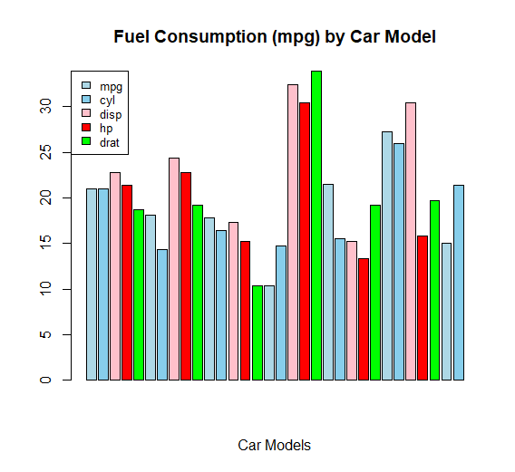
# Change x-axis labels using names() function to extract variable names from mtcars dataset and pass them as arguments to barplot() function for customization purposes based on specific requirements .
barplot(mtcars$mpg, main="Fuel Consumption (mpg) by Car Model", xlab="Car Models", col=c("lightblue","skyblue","pink","red","green"), legend=names(mtcars)[1:5], cex.main=1.2, cex.lab=1.2)
# Customize main title, x-axis label, color scheme, legend placement, and font sizes for better readability and visual appeal based on your specific requirements .
Step 4: Adding Legend Using Legend() Function (Optional)
If you want to add a legend to your barplot(), you can use the legend() function after creating your barplot().
This will help users understand which colors represent which car models.
Here’s how you can do it:
# Add legend using legend() function after creating barplot() for better clarity and interpretation based on your specific .
legend("topleft", legend=names(mtcars)[1:5], fill=c("lightblue","skyblue","pink","red","green"), cex=0.8)


