Skip to content

Data Science Tutorials

For Data Science Learners

  • Data Science Challenges in R Programming Language
    Data Science Challenges in R Programming Language Machine Learning
  • How to create a heatmap in R
    How to create a heatmap in R R
  • How Do Machine Learning Chatbots Work
    How Do Machine Learning Chatbots Work Machine Learning
  • Extract columns of data frame in R R
  • How to Analyze Likert Scale Data
    How to Analyze Likert Scale Data? Statistics
  • Determine the significance of a mediation effect in R
    Determine the significance of a mediation effect in R R
  • Calculating Conditional Probability in R
    Calculating Conditional Probability in R R
  • Arrange the rows in a specific sequence in R
    Arrange the rows in a specific sequence in R R
pheatmap function in R

The pheatmap function in R

Posted on October 25October 25 By Admin No Comments on The pheatmap function in R

The pheatmap function in R, the pheatmap function gives you more control over the final plot than the standard base R heatmap does.

A numerical matrix holding the values to be plotted can be passed.

How to create Anatogram plot in R – Data Science Tutorials

# install.packages("pheatmap")
library(pheatmap)
# Data 
set.seed(123)
m <- matrix(rnorm(200), 10, 10)
colnames(m) <- paste("Col", 1:10)
rownames(m) <- paste("Row", 1:10)
# Heat map
pheatmap(m)

Normalization

If the matrix’s values are not normalized, you can use the scale parameter to normalize them by either the rows (“row”) or the columns (“column”) of the matrix.

How to Create an Interaction Plot in R? – Data Science Tutorials

m <- matrix(rnorm(200), 10, 10)
colnames(m) <- paste("Col", 1:10)
rownames(m) <- paste("Row", 1:10)
# Heat map
pheatmap(m, scale = "column")
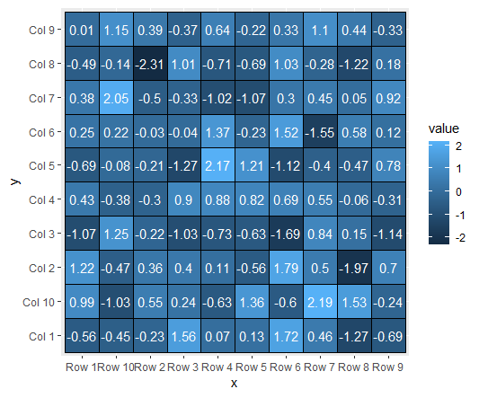
Values

Display_numbers = TRUE causes the values for each cell to be displayed. The text’s size and colour can both be changed.

pheatmap(m,
         display_numbers = TRUE,
         number_color = "black", 
         fontsize_number = 8)

How to Rank by Group in R? – Data Science Tutorials

Number of clusters

With kmeans_k, the number of clusters can be altered. If there aren’t enough clusters, you can enlarge the cells using cellheight or cellwidth.

pheatmap(m, kmeans_k = 3, cellheight = 50)

Remove rows dendrogram

pheatmap(m, cluster_rows = FALSE)

Remove columns dendrogram

pheatmap(m, cluster_cols = FALSE)

How to create a ggalluvial plot in R? – Data Science Tutorials

Remove dendrograms

pheatmap(m,
         cluster_cols = FALSE,
         cluster_rows = FALSE)

Border color

pheatmap(m, border_color = "black")

Color palette

pheatmap(m, color = hcl.colors(50, "BluYl"))

Legend breaks

heatmap(m, legend_breaks = c(-2, 0, 2))

Legend labels

pheatmap(m,
         legend_breaks = c(-2, 0, 2),
         legend_labels = c("Low", "Medium", "High"))

How to Use Spread Function in R?-tidyr Part1 (datasciencetut.com)

Remove the legend

pheatmap(m, legend = FALSE)

Check your inbox or spam folder to confirm your subscription.

R

Post navigation

Previous Post: How to create a heatmap in R
Next Post: How to create a hexbin chart in R

Related Posts

  • How to perform kruskal wallis test in r
    How to perform the Kruskal-Wallis test in R? R
  • Creating a Histogram of Two Variables in R R
  • How to Rank by Group in R?
    How to Rank by Group in R? R
  • How to Use Spread Function in R
    How to Use Spread Function in R?-tidyr Part1 R
  • How to add Axes to Plot in R R
  • Cumulative Sum calculation in R
    Cumulative Sum calculation in R R

Leave a Reply Cancel reply

Your email address will not be published. Required fields are marked *

  • Best Prompt Engineering Books
  • Understanding Machine Learning and Data Science
  • Best Git Books
  • Top 5 Books to Learn Data Engineering
  • Mastering R Programming for Data Science: Tips and Tricks
  • About Us
  • Contact
  • Disclaimer
  • Privacy Policy

https://www.r-bloggers.com

  • YouTube
  • Twitter
  • Facebook
  • Course
  • Excel
  • Machine Learning
  • Opensesame
  • R
  • Statistics

Check your inbox or spam folder to confirm your subscription.

  • Top Data Modeling Tools for 2023
    Top Data Modeling Tools for 2023 Machine Learning
  • How to Join Data Frames for different column names in R
    How to Join Data Frames for different column names in R R
  • How to Calculate Ratios in R
    How to Calculate Ratios in R R
  • Box Cox transformation in R
    Box Cox transformation in R R
  • ChatGPT Coursera Review
    ChatGPT Coursera Review Course
  • Compare numeric vectors in R R
  • computational gastronomy for data science
    Computational Gastronomy for Data Science Machine Learning
  • Find the Maximum Value by Group in R
    Find the Maximum Value by Group in R R

Privacy Policy

Copyright © 2025 Data Science Tutorials.

Powered by PressBook News WordPress theme