Skip to content

Data Science Tutorials

For Data Science Learners

  • Home
  • R
  • Statistics
  • Course
  • Machine Learning
  • Contact
  • About Us
  • Toggle search form
  • Extract values from vector in R: dplyr R
  • Cumulative Sum calculation in R
    Cumulative Sum calculation in R R
  • Control Chart in Quality Control
    Control Chart in Quality Control-Quick Guide Statistics
  • How to Load the Analysis ToolPak in Excel
    How to Load the Analysis ToolPak in Excel Excel
  • computational gastronomy for data science
    Computational Gastronomy for Data Science Machine Learning
  • Descriptive Statistics in R R
  • Linear Interpolation in R
    Linear Interpolation in R-approx R
  • Best Data Science YouTube Tutorials
    Best Data Science YouTube Tutorials Free to Learn Course
How to create a heatmap in R

How to create a heatmap in R

Posted on October 24October 25 By Admin No Comments on How to create a heatmap in R

How to create a heatmap in R, you must convert a numerical matrix into a data frame that ggplot2 can interpret.

Use the melt function from the reshape package for that.

How to make a rounded corner bar plot in R? – Data Science Tutorials

library(reshape)
set.seed(123)
m <- matrix(round(rnorm(200), 2), 10, 10)
colnames(m) <- paste("Col", 1:10)
rownames(m) <- paste("Row", 1:10)
# Transform the matrix in long format
df <- melt(m)
colnames(df) <- c("x", "y", "value")
head(df)
     x     y value
1 Row 1 Col 1 -0.56
2 Row 2 Col 1 -0.23
3 Row 3 Col 1  1.56
4 Row 4 Col 1  0.07
5 Row 5 Col 1  0.13
6 Row 6 Col 1  1.72

Heat map with geom_tile

When using geom_tile in ggplot2, a heap map can be produced by giving categorical variables to the x and y inputs and a continuous variable to the fill argument of the aes function.

Data Science Challenges in R Programming Language (datasciencetut.com)

# install.packages("ggplot2")
library(ggplot2)
ggplot(df, aes(x = x, y = y, fill = value)) +
  geom_tile()

Square tiles

Be aware that the tiles may not be squared depending on the size of the plotting window. Use cood_fixed if you wish to keep them square.

library(ggplot2)
ggplot(df, aes(x = x, y = y, fill = value)) +
  geom_tile() +
  coord_fixed()

Border customization

With colour, lwd, and linetype, respectively, you can change the border colour, line width, and line style of the tiles.

How to Use Mutate function in R – Data Science Tutorials

library(ggplot2)
ggplot(df, aes(x = x, y = y, fill = value)) +
  geom_tile(color = "white",
            lwd = 1.5,
            linetype = 1) +
  coord_fixed()

Adding the values

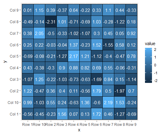
Additionally, you may use the geom_text function to add values over tiles while giving a number variable as the label argument for the aes function.

ggplot(df, aes(x = x, y = y, fill = value)) +
  geom_tile(color = "black") +
  geom_text(aes(label = value), color = "white", size = 4) +
  coord_fixed()

Algorithm Classifications in Machine Learning – Data Science Tutorials

Color palette

There are three options for altering the heat map’s default colour scheme.

scale_fill_gradient

ggplot(df, aes(x = x, y = y, fill = value)) +
  geom_tile(color = "black") +
  scale_fill_gradient(low = "white", high = "red") +
  coord_fixed()

Random Forest Machine Learning Introduction – Data Science Tutorials

scale_fill_gradient2

ggplot(df, aes(x = x, y = y, fill = value)) +
  geom_tile(color = "black") +
  scale_fill_gradient2(low = "#075AFF",
                       mid = "#FFFFCC",
                       high = "#FF0000") +
  coord_fixed()

How to Group and Summarize Data in R – Data Science Tutorials

scale_fill_gradientn

ggplot(df, aes(x = x, y = y, fill = value)) +
  geom_tile(color = "black") +
  scale_fill_gradientn(colors = hcl.colors(20, "RdYlGn")) +
  coord_fixed()

Check your inbox or spam folder to confirm your subscription.

How to create Anatogram plot in R – Data Science Tutorials

R

Post navigation

Previous Post: Box Cox transformation in R
Next Post: The pheatmap function in R

Related Posts

  • sorting in r
    Sorting in r: sort, order & rank R Functions R
  • Mastering the map() Function in R R
  • Error in solve.default(mat)  Lapack routine dgesv system is exactly singular
    Error in solve.default(mat) :  Lapack routine dgesv: system is exactly singular: U[2,2] = 0 R
  • How to handle Imbalanced Data
    How to handle Imbalanced Data? R
  • Making games in R- Nara and eventloop Game Changers
    Making games in R- Nara and eventloop Game Changers Machine Learning
  • How to Filter Rows In R
    How to Filter Rows In R? R

Leave a Reply Cancel reply

Your email address will not be published. Required fields are marked *

  • Multiple regression model in R
  • Descriptive statistics in R
  • How to Find the Size of a Data Frame in R
  • Filter a Vector in R
  • Split a Vector into Chunks in R
  • About Us
  • Contact
  • Disclaimer
  • Privacy Policy

https://www.r-bloggers.com

  • YouTube
  • Twitter
  • Facebook
  • Course
  • Excel
  • Machine Learning
  • Opensesame
  • R
  • Statistics

Check your inbox or spam folder to confirm your subscription.

  • In data science, what Is Open Innovation?
    In data science, what Is Open Innovation? R
  • How to add columns to a data frame in R
    How to add columns to a data frame in R R
  • How to Join Data Frames for different column names in R
    How to Join Data Frames for different column names in R R
  • How to change the column positions in R?
    How to change the column positions in R? R
  • Algorithm Classifications in Machine Learning
    Algorithm Classifications in Machine Learning Machine Learning
  • Best GGPlot Themes
    Best GGPlot Themes You Should Know R
  • Group By Maximum in R
    Group By Maximum in R R
  • Two-Way ANOVA Example in R
    Two-Way ANOVA Example in R-Quick Guide R

Privacy Policy

Copyright © 2024 Data Science Tutorials.

Powered by PressBook News WordPress theme