


In this article, you’ll learn how to change the colors of ggplot2 visuals in the R programming language by utilizing different themes.
Let’s start by making some sample data in R.
set.seed(123)
df <- data.frame(x = rnorm(100),
                   y = rnorm(100),
                   group = paste0("group_", LETTERS[1:5]))
head(df)
        x          y   group
1  0.7842588 -0.3663221 group_A
2  1.2604525 -0.4016048 group_B
3  1.0959772  0.5219341 group_C
4 -2.4218639  1.1077222 group_D
5  0.7651984 -0.7216053 group_E
6 -0.5019940  1.3688690 group_A
The head of our sample data is visible above, as well as the fact that our data is made up of three variables. x and y are numerical variables, while the group is a character variable.
How to make a rounded corner bar plot in R? – Data Science Tutorial
To use the ggplot2 package to visualize our data, we must first install and import it into R.
install.packages("ggplot2")
library("ggplot2")
Then, using the R syntax below, we can make a ggplot2 scatterplot of our data.
plot<- ggplot(df, aes(x, y, col = group)) +
  geom_point()
plot

By using the preceding R syntax, we were able to produce a ggplot2 plot with default color parameters, as seen in Figure 1.
Example 1: Using Default Themes, Change the Color Scheme of a ggplot2 Plot
The following R code shows how to change the colors of our graph using the ggplot2 package’s predefined themes.
We can utilize the several pre-defined theme functions offered by the ggplot2 package for this task, as illustrated below.
plot_bw <- plot + theme_bw() + ggtitle("theme_bw()")
plot_classic <- plot + theme_classic() + ggtitle("theme_classic()")
plot_dark <- plot + theme_dark() + ggtitle("theme_dark()")
How to perform the MANOVA test in R? – Data Science Tutorials

plot_gray <- plot + theme_gray() + ggtitle("theme_gray()")
plot_linedraw <- plot + theme_linedraw() + ggtitle("theme_linedraw()")
plot_light <- plot + theme_light() + ggtitle("theme_light()")
plot_minimal <- plot + theme_minimal() + ggtitle("theme_minimal()")
plot_test <- plot + theme_test() + ggtitle("theme_test()")
Classification Problem in Machine Learning »

plot_void <- plot + theme_void() + ggtitle("theme_void()")
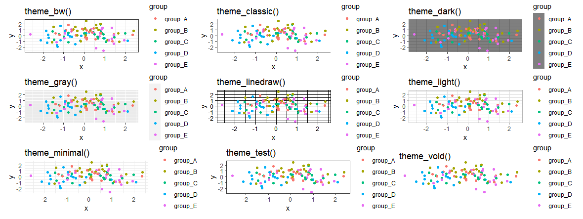
The previous R code generated nine ggplot2 charts, each with a unique theme design.
The patchwork package can then be used to create a comparison grid of these plots. We’ll need to install and load the patchwork package first.
install.packages("patchwork")
library("patchwork")
Now we can arrange our nine plots in a grid as seen below:
(plot_bw + plot_classic + plot_dark) /
  (plot_gray + plot_linedraw + plot_light) /
  (plot_minimal + plot_test + plot_void)

The previous diagram depicts the many themes and their various color schemes.
As you can see, the majority of these themes are rather straightforward. Let’s make our plots more colorful!
Using the ggthemr package, change the color scheme of a ggplot2 plot.
The ggthemr package by Ciarán Tobin, which is now maintained by Mikata Project, is a powerful tool for designing, styling, and coloring ggplot2 plots.
The following R code can be used to install and load the package.
library("devtools")
devtools::install_github("Mikata-Project/ggthemr")
library("ggthemr")
The ggthemr function can now be used to modify the ggplot2 theme layout. The R algorithms and graphical outputs below show how to change the theme choices of our example plot to suit other styles.
Intro to Tensorflow-Machine Learning with TensorFlow »
ggthemr("flat")
plot
ggthemr("flat dark")
plot
ggthemr("camouflage")
plot
ggthemr("chalk")
plot
ggthemr("copper")
plot
ggthemr(“dust”)
plot

ggthemr("earth")
plot
ggthemr("fresh")
plot
ggthemr("grape")
plot
ggthemr("grass")
plot
ggthemr("greyscale")
plot
ggthemr("light")
plot
ggthemr("lilac")
plot
ggthemr("pale")
plot
ggthemr("sea")
plot
ggthemr("sky")
plot
ggthemr("solarized")
plot
As you can see, the ggthemr package comes with a wide range of pre-defined themes.
You can also manually develop your own ggplot2 theme if you want complete control over your ggplot2 themes. More information about custom themes may be found here.
Data Mining and Knowledge Discovery »