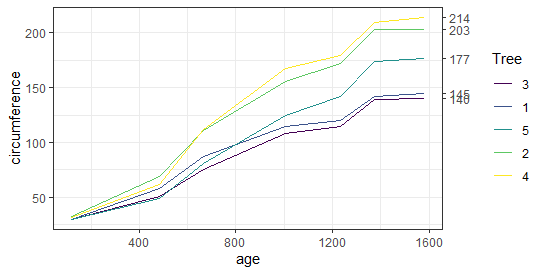
Adding Subtitles in ggplot2, Data visualization is a critical aspect of data analysis, allowing for the communication of complex data in a manner that is accessible and understandable.
One of the most popular packages for creating visualizations in R is ggplot2, which stands out for its versatility and ease of use.
In this article, we will delve into the process of adding subtitles to your ggplot2 visualizations, providing you with three practical examples to enhance the clarity and effectiveness of your plots.
Example 1: Adding a Simple Subtitle
The first method involves adding a straightforward subtitle to your plot. This can be achieved by utilizing the labs() function within ggplot2.
Here’s a simple code snippet to illustrate this:
library(ggplot2)

# Create a data frame
df <- data.frame(hours=c(1, 2, 3, 4, 5), score=c(76, 77, 78, 79, 80))

# Create a scatter plot with a subtitle
ggplot(df, aes(x=hours, y=score)) +
  geom_point() +
  labs(title='Study Hours vs. Test Scores', subtitle='This is a subtitle')
This code will produce a scatter plot with the main title ‘Study Hours vs. Test Scores’ and a subtitle ‘This is a subtitle’.
Free Data Science Books » EBooks » finnstats
Example 2: Adding a Multi-line Subtitle
Sometimes, you may need to provide additional context or information in your subtitle, which can require more space than a single line.
To add a multi-line subtitle, you can insert line breaks using \n within your subtitle text. Here’s how you can do it:
# Create a scatter plot with a multi-line subtitle
ggplot(df, aes(x=hours, y=score)) +
  geom_point() +
  labs(title='Study Hours vs. Test Scores', subtitle="This is the first line\nThis is the second line")
The \n character is used to split the subtitle into two lines, improving readability.
Example 3: Customizing the Subtitle’s Appearance
The third example demonstrates how to customize the appearance of your subtitle, such as changing the font size, style, and color.
This can be done using the theme() function along with element_text() to specify the desired subtitle properties:
# Create a scatter plot with a customized subtitle
ggplot(df, aes(x=hours, y=score)) +
  geom_point() +
  labs(title='Study Hours vs. Test Scores', subtitle='Customized subtitle') +
  theme(plot.subtitle=element_text(size=14, face='italic', color='blue'))
In this example, the subtitle ‘Customized subtitle’ is displayed in blue italic font with a size of 14.
By following these examples, you can add informative subtitles to your ggplot2 plots, making your data visualizations more informative and engaging.
Whether you’re presenting data in a report, a publication, or a presentation, subtitles can provide valuable context and insights to your audience.
Dive deeper into the world of R programming and data visualization to unlock the full potential of your data analysis endeavors. Happy plotting!
Python Archives »
Data Analysis in R
Google Sheet Archives »
Google Sheet Archives »
Free Data Science Books » EBooks »


