Skip to content

Data Science Tutorials

  • Home
  • R
  • Statistics
  • Course
  • Machine Learning
  • Guest Blog
  • Contact
  • About Us
  • Toggle search form
  • Two Sample Proportions test in R
    Two Sample Proportions test in R-Complete Guide R
  • Best online course for R programming
    Best online course for R programming Course
  • How to perform MANOVA test in R
    How to perform the MANOVA test in R? R
  • How to do Conditional Mutate in R
    How to do Conditional Mutate in R? R
  • test for normal distribution in r
    Test for Normal Distribution in R-Quick Guide R
  • Convert Multiple Columns to Numeric in R
    Convert Multiple Columns to Numeric in R R
  • How to convert characters from upper to lower case in R
    How to convert characters from upper to lower case in R? R
  • Checking Missing Values in R
    Checking Missing Values in R R
display the last value of each line in ggplot

How to add labels at the end of each line in ggplot2?

Posted on May 25May 25 By Jim No Comments on How to add labels at the end of each line in ggplot2?
Tweet
Share
Share
Pin

How to add labels at the end of each line in ggplot2?, Using the ggplot2 R library, this article shows how to display the last value of each line as a label.

Using either the ggrepel text labeling or the ggplot2 secondary axis functions, many methods are shown.

Test for Normal Distribution in R-Quick Guide – Data Science Tutorials

R packages required:

tidyverse: data visualization and manipulation made simple

geom_text repel() and geom_label repel() are geoms for ggplot2 that repel overlapping text_labels ()

Let’s load R packages

library(tidyverse)
library(ggrepel)

Set ggplot2 default theme to theme_bw()

theme_set(theme_bw())

Let’s create a some sample data

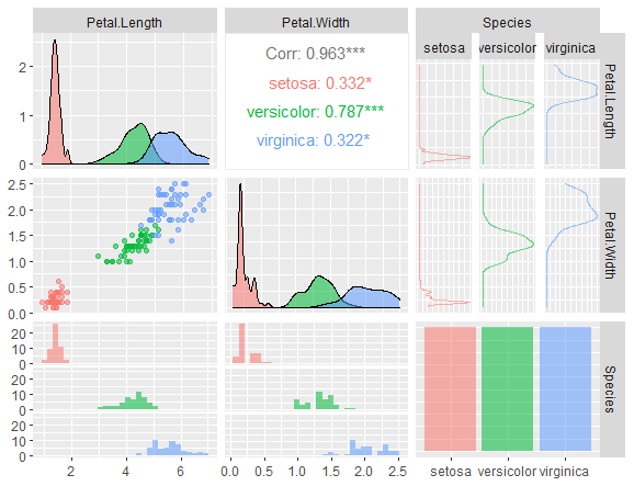
df <- tibble::tribble(
      ~Species, ~Petal.Length, ~Petal.Width, ~Sepal.Length, ~Sepal.Width,
      "setosa",         1.462,        0.246,         5.006,        3.428,
  "versicolor",          4.26,        1.326,         5.936,         2.77,
   "virginica",         5.552,        2.026,         6.588,        2.974
  )
df
Species    Petal.Length Petal.Width Sepal.Length Sepal.Width
  <chr>             <dbl>       <dbl>        <dbl>       <dbl>
1 setosa             1.46       0.246         5.01        3.43
2 versicolor         4.26       1.33          5.94        2.77
3 virginica          5.55       2.03          6.59        2.97

We can now convert the data into a longer format.

How to make a rounded corner bar plot in R? – Data Science Tutorials

df_long <- df %>%
  pivot_longer(
    Petal.Length:Sepal.Width,
    names_to = "variable", values_to = "value"
  )
df_long
Species    variable     value
   <chr>      <chr>        <dbl>
 1 setosa     Petal.Length 1.46
 2 setosa     Petal.Width  0.246
 3 setosa     Sepal.Length 5.01 
 4 setosa     Sepal.Width  3.43
 5 versicolor Petal.Length 4.26
 6 versicolor Petal.Width  1.33
 7 versicolor Sepal.Length 5.94
 8 versicolor Sepal.Width  2.77
 9 virginica  Petal.Length 5.55
10 virginica  Petal.Width  2.03
11 virginica  Sepal.Length 6.59
12 virginica  Sepal.Width  2.97

Adding labels to the line ends with ggrepel

Basic line plot examples for the discrete x-axis

plot<- ggplot(df_long, aes(x = Species, y = value, group = variable)) +
  geom_line(aes(color = variable)) +
  geom_point() +
  theme(legend.position = "top")
plot

How to add labels at the end of each line in ggplot2?

Add the last values to the line plot after filtering them.

Dealing With Missing values in R – Data Science Tutorials

It’s the same as the ‘virginica’ species.

data_ends <- df_long %>% filter(Species == "virginica")
plot +
  geom_text_repel(
    aes(label = value), data = data_ends,
    fontface ="plain", color = "black", size = 3
    )

Label variables with their names.

plot2 <- ggplot(df_long, aes(x = Species, y = value, group = variable)) +
  geom_line() +
  geom_point()
plot2 +  geom_text_repel(
    aes(label = variable), data = data_ends,
    color = "black", size = 3
    )

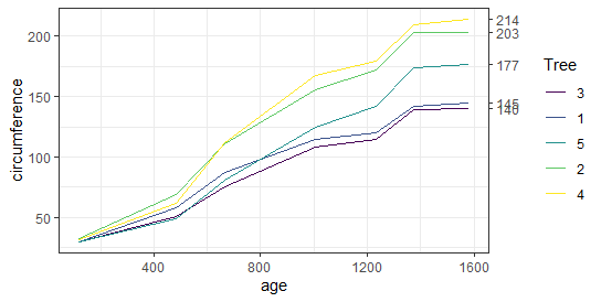
Let’s work on time series data

df2 <- Orange
head(df2)
  Tree  age circumference
1    1  118            30
2    1  484            58
3    1  664            87
4    1 1004           115
5    1 1231           120
6    1 1372           142

As usual, filter the last values

data_ends <- df2 %>%
  group_by(Tree) %>%
  top_n(1, age)
data_ends
Tree    age circumference
  <ord> <dbl>         <dbl>
1 1      1582           145
2 2      1582           203
3 3      1582           140
4 4      1582           214
5 5      1582           177
ggplot(df2, aes(age, circumference)) +
  geom_line(aes(color = Tree)) +
  geom_text_repel(
    aes(label = circumference), data = data_ends,
    size = 3)

Key R functions: Using a supplementary y-axis to show the line labels To produce a second axis on the right, the ggplot2 scale y continuous() method is combined with the option sec.axis.

Hypothesis Testing Examples-Quick Overview – Data Science Tutorials

The vector of values matching the line ends determines the numbers to be displayed at breaks.

Get the last values vector

data_ends <- df2 %>%
  group_by(Tree) %>%
  top_n(1, age) %>%
  pull(circumference)
data_ends
[1] 145 203 140 214 177

Make a line graph with labels.

ggplot(df2, aes(x = age, y = circumference)) +
      geom_line(aes(color = Tree)) +
      scale_y_continuous(sec.axis = sec_axis(~ ., breaks = data_ends))

Check your inbox or spam folder to confirm your subscription.

Tweet
Share
Share
Pin
R Tags:ggrepel, label

Post navigation

Previous Post: Artificial Intelligence Examples-Quick View
Next Post: One sample proportion test in R-Complete Guide

Related Posts

  • Difference between R and Python
    Difference between R and Python R
  • Arrange the rows in a specific sequence in R
    Arrange the rows in a specific sequence in R R
  • Error in sum(List) : invalid 'type' (list) of argument
    Error in sum(List) : invalid ‘type’ (list) of argument R
  • How to Get a Job as a Data Engineer
    How to Get a Job as a Data Engineer? R
  • Data Science Challenges in R Programming Language
    Data Science Challenges in R Programming Language Machine Learning
  • How to Join Data Frames for different column names in R
    How to Join Data Frames for different column names in R R

Leave a Reply Cancel reply

Your email address will not be published. Required fields are marked *

  • About Us
  • Contact
  • Disclaimer
  • Guest Blog
  • Privacy Policy
  • YouTube
  • Twitter
  • Facebook
  • Top 7 Skills Required to Become a Data Scientist
  • Learn Hadoop for Data Science
  • How Do Online Criminals Acquire Sensitive Data
  • Top Reasons To Learn R in 2023
  • Linear Interpolation in R-approx

Check your inbox or spam folder to confirm your subscription.

 https://www.r-bloggers.com
  • Best Data Science YouTube Tutorials
    Best Data Science YouTube Tutorials Free to Learn Course
  • Top 10 Data Visualisation Tools
    Top 10 Data Visualisation Tools Every Data Science Enthusiast Must Know Course
  • Comparing group means in R
    One way ANOVA Example in R-Quick Guide R
  • Comparison between Statistics and Luck
    Lottery Prediction-Comparison between Statistics and Luck Machine Learning
  • Add new calculated variables to a data frame and drop all existing variables
    Add new calculated variables to a data frame and drop all existing variables R
  • Change ggplot2 Theme Color in R
    Change ggplot2 Theme Color in R ggthemr Package R
  • How to perform TBATS Model in R
    How to perform TBATS Model in R R
  • similarity measure between two populations
    Similarity Measure Between Two Populations-Brunner Munzel Test Statistics

Copyright © 2023 Data Science Tutorials.

Powered by PressBook News WordPress theme