


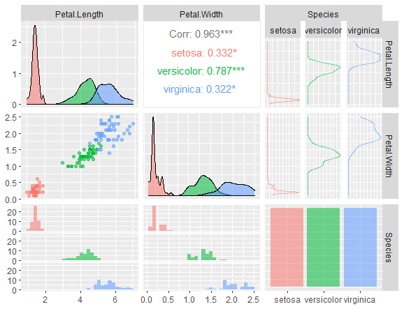
ggpairs in R, A function called ggpairs, which is the ggplot2 equivalent of the pairs function in base R, is offered by the GGally.
Both continuous and categorical variables can be passed in a data frame.
By default, the upper panel will display the relationship between the continuous variables, the lower panel will display their scatter plots, the diagonal will display their density plots, and the sides will display their histograms and box plots for relationships between their categorical and continuous counterparts.
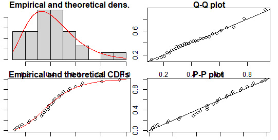
Detecting and Dealing with Outliers: First Step – Data Science Tutorials
library(GGally)
ggpairs(iris)
column choice
The data frame’s columns can be chosen using the columns argument before being plotted.
A character or numeric vector that contains the variable names is what you can specify.
In the example below, the data set’s categorical variable is eliminated.
library(GGally)
ggpairs(iris,columns = 1:4)

Grouped by colour
With aes, you can define an attractive mapping. The density plots, scatter plots, and other plots can then be made and filled with various colors based on the groups.
How to Find Optimal Clusters in R? – Data Science Tutorials
library(GGally)
ggpairs(iris,
columns = 1:4,
aes(color = Species, alpha = 0.5))
Font Size
The correlation values don’t fit on the upper panel, as you may have seen. You can use the following line to adjust the font size:
ggpairs(iris, columns = 1:4, aes(color = Species, alpha = 0.5),
        upper = list(continuous = wrap("cor", size = 2.5)))
Panels on the top, bottom, and diagonal
With upper, lower, and diag arguments, the upper, lower, and diagonal panels can all be fully customized. Every argument’s default value is a list of various variables.
You must pay attention to the ggally () functions’ endings and pass them as character inputs.
Top panel
To add scatter plots to the upper panel, pass “points” to the continuous variable in the upper argument’s list.
This is due to the existence of the function ggally points.
glm function in r-Generalized Linear Models – Data Science Tutorials
ggpairs(iris, columns = 1:4, aes(color = Species, alpha = 0.5),
upper = list(continuous = "points"))
Lower panel
The next sample includes scatter plots with ggally smoothed lines.
ggpairs(iris, columns = 1:4, aes(color = Species, alpha = 0.5),
lower = list(continuous = "smooth"))
Diagonal
By default, the diag argument is set to “densityDiag”. Additionally, “barDiag” and “blankDiag” allow you to pass the diagonal.
Extract patterns in R? – Data Science Tutorials
ggpairs(iris, columns = 1:4, aes(color = Species, alpha = 0.5),
diag = list(continuous = "blankDiag"))
Types of variables
The graphs depicting the combination of categorical and numerical variables can be customized if the data set includes categorical variables, as shown below.
Upper
You can choose a different chart for the categorical variables on the upper panel by using the combo variable.
Facet densities are being added in the example below (ggally facetdensity).
Sorting in r: sort, order & rank R Functions – Data Science Tutorials
ggpairs(iris[3:5], aes(color = Species, alpha = 0.5),
upper = list(combo = "facetdensity"))

Lower
The lower panel might use the same procedure. The following example uses rectangles with proportionate areas (ggally count) to display counts of observations.
ggpairs(iris[3:5], aes(color = Species, alpha = 0.5),
lower = list(combo = "count"))