Skip to content

Data Science Tutorials

For Data Science Learners

  • Home
  • R
  • Statistics
  • Course
  • Machine Learning
  • Contact
  • About Us
  • Toggle search form
  • Logistic Function in R R
  • Replace NA with Zero in R
    Replace NA with Zero in R R
  • Hypothesis Testing in R Programming
    Hypothesis Testing in R Programming R
  • How to remove files and folders in R
    How to remove files and folders in R R
  • Determine the significance of a mediation effect in R
    Determine the significance of a mediation effect in R R
  • How to perform MANOVA test in R
    How to perform the MANOVA test in R? R
  • How to Use Spread Function in R
    How to Use Spread Function in R?-tidyr Part1 R
  • Steps to Mastering Natural Language Processing
    Steps to Mastering Natural Language Processing Machine Learning
How to Visualize PCA Results in R

How to Visualize PCA Results in R

Posted on June 17June 17 By Admin No Comments on How to Visualize PCA Results in R

How to Visualize PCA Results in R, An unsupervised machine learning technique called principal components analysis (PCA) looks for primary components that account for a significant amount of the variation in a dataset.

A biplot, which plots every observation in a dataset on a plane defined by the first two main components, can be used to see the PCA findings for a particular dataset.

To make a biplot in R, we can utilize the fundamental syntax shown below:

How to Visualize PCA Results in R

We’ll use the USArrests dataset from the built-in R environment for this example.

See the USArrests dataset’s first six rows.

head(USArrests)
           Murder Assault UrbanPop Rape
Alabama      13.2     236       58 21.2
Alaska       10.0     263       48 44.5
Arizona       8.1     294       80 31.0
Arkansas      8.8     190       50 19.5
California    9.0     276       91 40.6
Colorado      7.9     204       78 38.7

To perform PCA and display the results in a biplot, we may use the code below:

How Do Machine Learning Chatbots Work – Data Science Tutorials

proceed to PCA

results <- princomp(USArrests)

PCA findings can be shown in a biplot.

biplot(results)

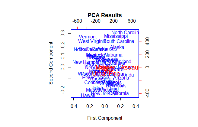
The first principle component is displayed on the x-axis, the second principal component is displayed on the y-axis, and the individual dataset observations are displayed inside the plot together with the four red-hued variables.

Be aware that the biplot function has a number of arguments we can use to change the plot’s appearance.

For instance, we can change the plot’s colors, font size, axis boundaries, plot title, axis titles, and size of the arrows by using the following code:

Let’s generate a custom-looking biplot

biplot(results,
       col=c('blue', 'red'),
       cex=c(1, 1.3),
       xlim=c(-.4, .4),
       main='PCA Results',
       xlab='First Component',
       ylab='Second Component',
       expand=1.2)

It’s a little bit simpler to interpret this biplot than the last one.

Dynamic data visualizations in R – Data Science Tutorials

R

Post navigation

Previous Post: In data science, what Is Open Innovation?
Next Post: How to check regression analysis heteroscedasticity in R

Related Posts

  • Convert Multiple Columns to Numeric in R
    Convert Multiple Columns to Numeric in R R
  • How to do Pairwise Comparisons in R?
    How to do Pairwise Comparisons in R? R
  • Pattern Mining Analysis in R-With Examples R
  • How to use image function in R
    How to use the image function in R R
  • Error in rbind(deparse.level ...) numbers of columns of arguments do not match
    Error in rbind(deparse.level …) numbers of columns of arguments do not match R
  • How to Use “not in” operator in Filter
    How to Use “not in” operator in Filter R

Leave a Reply Cancel reply

Your email address will not be published. Required fields are marked *

  • R-Change Number of Bins in Histogram
  • How to Specify Histogram Breaks in R
  • Creating a Histogram of Two Variables in R
  • Adding Subtitles in ggplot2
  • Add Footnote to ggplot2
  • About Us
  • Contact
  • Disclaimer
  • Privacy Policy

https://www.r-bloggers.com

  • YouTube
  • Twitter
  • Facebook
  • Course
  • Excel
  • Machine Learning
  • Opensesame
  • R
  • Statistics

Check your inbox or spam folder to confirm your subscription.

  • best books about data analytics
    Best Books to learn Tensorflow Course
  • Two-Way ANOVA Example in R
    How to perform One-Sample Wilcoxon Signed Rank Test in R? R
  • Correlation Coefficient p value in R
    Correlation Coefficient p value in R R
  • Remove Columns from a data frame
    How to Remove Columns from a data frame in R R
  • Autocorrelation and Partial Autocorrelation in Time Series
    Autocorrelation and Partial Autocorrelation in Time Series Statistics
  • How to use image function in R
    How to use the image function in R R
  • How to Use the Multinomial Distribution in R
    How to Use the Multinomial Distribution in R? R
  • Calculating Conditional Probability in R
    Calculating Conditional Probability in R R

Privacy Policy

Copyright © 2024 Data Science Tutorials.

Powered by PressBook News WordPress theme