Interactive 3d plot in R, This R lesson shows how to create dynamic 3d graphics with R and the scatter3d function from the package car.
The rgl package is used by the scatter3d() function to draw and animate 3D scatter plots.
Install and load all necessary packages.
For this tutorial, you’ll need the rgl and car packages.
Two Sample Proportions test in R-Complete Guide – Data Science Tutorials
install.packages(c("rgl", "car"))
Load the packages:
library("car")
library("rgl")
In the following cases, we’ll use the iris data set.
data(iris)
head(iris)
  Sepal.Length Sepal.Width Petal.Length Petal.Width Species
1          5.1         3.5          1.4         0.2  setosa
2          4.9         3.0          1.4         0.2  setosa
3          4.7         3.2          1.3         0.2  setosa
4          4.6         3.1          1.5         0.2  setosa
5          5.0         3.6          1.4         0.2  setosa
6          5.4         3.9          1.7         0.4  setosa
sep.l <- iris$Sepal.Length
sep.w <- iris$Sepal.Width
pet.l <- iris$Petal.Length
The iris data set contains measurements of the variables sepal length and breadth, as well as petal length and width, for 50 blooms from three different iris species. Iris setosa, versicolor, and virginica are the three species.
How to perform the MANOVA test in R? – Data Science Tutorials
The following are the simpler formats.
scatter3d(formula, data)
scatter3d(x, y, z)
The coordinates of the points to be plotted are x, y, and z, respectively. Depending on the structure of x, the variables y and z may be optional. formula: a model formula of the form y ~ x + z.
If you want to visualize the points by groups, use y ~ x + z | g, where g is a factor that divides the data into groups data: data frame to test the formula within
Example:
library(car)
3D plot with the regression plane
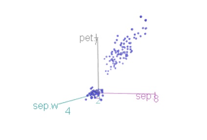
scatter3d(x = sep.l, y = pet.l, z = sep.w)

It’s worth noting that the plot can be manually rotated by pressing and holding the mouse or touchpad. It can also be zoomed by using the mouse scroll wheel, pressing ctrl + on the touchpad on a PC, or two fingers (up or down) on a Mac.
Control Chart in Quality Control-Quick Guide – Data Science Tutorials
Remove the regression surface and change the point colors:
scatter3d(x = sep.l, y = pet.l, z = sep.w,
        point.col = "blue", surface=FALSE)
Plot the points by groups
scatter3d(x = sep.l, y = pet.l, z = sep.w, groups = iris$Species)

Surfaces removal.
To delete simply the grids, use the grid = FALSE option as follows:
scatter3d(x = sep.l, y = pet.l, z = sep.w, groups = iris$Species,
          grid = FALSE)
The fit argument can be used to adjust the display of the surface(s). “Linear,” “quadratic,” “smooth,” and “additive” are all possible fit values.
scatter3d(x = sep.l, y = pet.l, z = sep.w, groups = iris$Species,
          grid = FALSE, fit = "smooth")
Surfaces should be removed. The surface = FALSE option is utilized.
scatter3d(x = sep.l, y = pet.l, z = sep.w, groups = iris$Species,
          grid = FALSE, surface = FALSE)
Concentration ellipsoids are added.
Detecting and Dealing with Outliers: First Step – Data Science Tutorials
scatter3d(x = sep.l, y = pet.l, z = sep.w, groups = iris$Species,
          surface=FALSE, ellipsoid = TRUE)
Remove the ellipsoids’ grids as follows.
scatter3d(x = sep.l, y = pet.l, z = sep.w, groups = iris$Species,
          surface=FALSE, grid = FALSE, ellipsoid = TRUE)
Change the color of the points in groups.
The surface.col argument is used. The color vector for the regression planes is surface.col.
Colors are utilized for the regression surfaces and the points in the various groups in multi-group displays.
scatter3d(x = sep.l, y = pet.l, z = sep.w, groups = iris$Species,
          surface=FALSE, grid = FALSE, ellipsoid = TRUE,
          surface.col = c("#999999", "#E69F00", "#56B4E9"))
Color palettes from the RColorBrewer package can also be used:
library("RColorBrewer")
colors <- brewer.pal(n=3, name="Dark2")
scatter3d(x = sep.l, y = pet.l, z = sep.w, groups = iris$Species,
          surface=FALSE, grid = FALSE, ellipsoid = TRUE,
          surface.col = colors)
Change the labels on the axes
Checking Missing Values in R – Data Science Tutorials
The following arguments are used: xlab, ylab, and zlab
scatter3d(x = sep.l, y = pet.l, z = sep.w,
        point.col = "blue", surface=FALSE,
        xlab = "Sepal Length (cm)", ylab = "Petal Length (cm)",
        zlab = "Sepal Width (cm)")
Remove axis scales: axis.scales = FALSE
scatter3d(x = sep.l, y = pet.l, z = sep.w,
        point.col = "blue", surface=FALSE,
        axis.scales = FALSE)
Axis colors can be changed.
The three axes are colored differently by default. Colors for the three axes are specified using the axis.col argument:
scatter3d(x = sep.l, y = pet.l, z = sep.w, groups = iris$Species,
          surface=FALSE, grid = FALSE, ellipsoid = TRUE,
          axis.col = c("black", "black", "black"))
Label the points with text labels.
The following arguments are used:
labels: one for each point, each with its own text label.
Best GGPlot Themes You Should Know – Data Science Tutorials
id.n: The number of somewhat extreme points that must be automatically identified.
scatter3d(x = sep.l, y = pet.l, z = sep.w,
          surface=FALSE, labels = rownames(iris), id.n=nrow(iris))
Images should be exported
The plot can be saved in either png or pdf format.
The screenshot is saved as a png file using the function rgl.snapshot():
rgl.snapshot(filename = "plot.png")
The rgl.postscript() function is used to save the screenshot as a ps, eps, tex, pdf, svg, or pgf file:
rgl.postscript("plot.pdf",fmt="pdf")